Are you making the most out of every marketing opportunity? Even small exchanges, like handing out your business card, can make a big impact on how people view your business. Small enough to be carried around in a wallet or purse, business cards are a powerful tool. A business card contains all the vital details of a company or individual. It serves as an easy reference for prospective clients to turn to when contacting you. Make your brand memorable by designing a high-quality business card. By following these tips, your business card, and business will surely stand out from the crowd.
Include Only the Most Important Information
It may sound obvious, but the first thing you should consider when designing a business card is the information you want to convey. It’s tempting to reduce the font size and include every last bit of information you have on your business card. You want to peek your client’s interests without making their heads spin. Consider what the most important details are. You need to strike a balance between having enough points of contact and not making it look too cluttered. Here are some essential things to include.
- Your name
- What you do
- Website
- Email address
- Phone Number
However, this is not the rule, but it is a framework. These points are flexible based on how you personally want to be contacted. If you don’t want them to email you, don’t include your email. Once you have vital points of contact established, then you can consider other points like QR codes, social media handles, and more.
Bringing In Color
When choosing colors, there is a lot to think about. Try to choose a color scheme that is aesthetically pleasing. A mashup of bright and bold colors can make your card stand out, but for the wrong reasons. Clashing colors can look tacky and unprofessional on a business card. That doesn’t mean that you can’t use bright colors, however. A bold color can make your card look fresh, exciting, and original. However, it is important to pair a bright color with a neutral so it acts as a pop of color and doesn’t overwhelm potential clients. When in doubt, choose colors that are in line with the rest of your company’s branding or look check out the various tools available online to help you create the perfect color scheme. When in doubt, a black and white card can still be memorable, striking, and often seen as more stylish too.
Is Your Text Readable?
If a client is looking at your card and squinting to read the text, your font size is too small. Granted not everyone needs glasses, but it’s best to not use a font size smaller than 8pt. Small text can often look readable onscreen but turn into an illegible smudge when printed. Granted, you don’t want your text to be too large, as it can look overbearing on the small space.
For fonts, keep it simple and professional. Do not turn to Comic Sans or a detailed calligraphic font that is impossible to decipher. Funky fonts are fun, but there’s a time an place for them and that place usually isn’t your business card. You can always spice up your card in other ways. Keep the text simple and straightforward.
Visuals
Pictures speak louder than words. This is true for business cards. When designing, consider having all your written content on one side of the card and save the other side for something more visual. Simple things, like displaying an image of your product, placing your company logo on the back, or using a picture you have taken, can leave a lasting impression. However, try to not leave the back blank. Think about how many times you’ve been given a card and flipped it over to look at the back. You’re missing out on vital promotional space by not having something on the back of your card.
Quality of Paper & Design
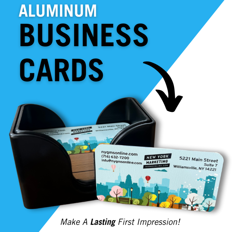
Now that you have a top-notch design, think about the type of paper you are using. Yes, even the paper can make an impact. Thick, sturdy paper will create the impression that your company is reliable and strong. They also tend to be more expensive. However, flimsy, cheaper paper will give your customers the opposite impression. Try thinking of your card as you would a handshake – nobody likes a limp handshake, so why would they like a limp business card? Other considerations include is what paper will make your colors pop and do you want matte, glossy, or a spot gloss.
Get Them Professionally Printed
Business cards can represent trustworthiness, honesty, and reliability. They are a token of remembrance and without one, you are putting your business at stake. Sure, you can print your own business cards at home with an inkjet printer, but consider professional printing instead. With professional printing, you are investing in high-quality printing, which will make a stronger first impression than DIY printed cards. At New York Marketing we offer quality printed materials for any business, big and small, to deliver great quality and fast service at a fair price.


