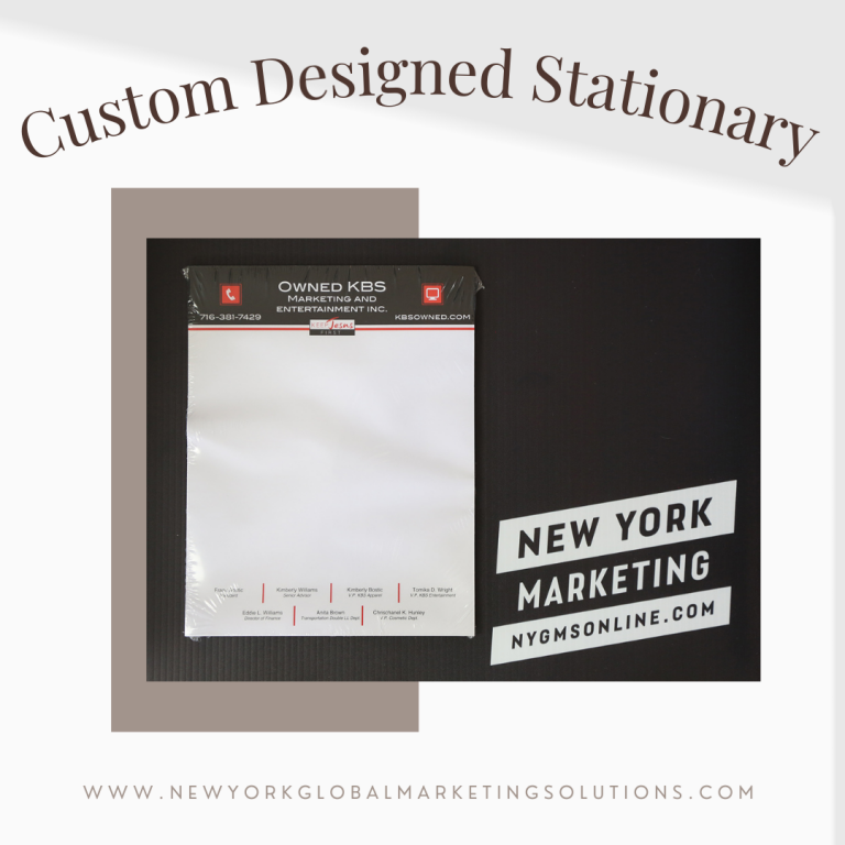
Flyers are one of the most cost-effective and fastest ways to promote your business. Flyers are also the easiest marketing medium to produce, as you can put together a flyer in just minutes with little or no design experience needed! With this article, we will give you tips on how to create effective flyers that stand out to the crowd.
Know Who Your Audience Is
It’s important for any marketing campaign to know who they’re targeting because it’s going to be easier to understand their needs. When designing a flyer, this means knowing what language they speak and what information would interest them so that you can create a flyer that’s direct and effective. You won’t have to worry about paying for expensive copywriters or writers if you already know who your target audience is.
Use Color Strategically
One thing that will help make your flyer stand out from the crowd is color. If you use too much color, however, it’ll distract the reader and they won’t be able to take in the information you want them to. When choosing a color scheme for your flyer, it’s best to choose two or three colors that complement each other and will stand out on the page.
Use Photos
Graphics are another great way of making your flyer effective since they’ll make the reader interested in your product straight away. The photos will pique their curiosity and make them more likely to read on. However, be careful with photos – don’t use too many or too little. A good rule for a flyer is to only have one photo surrounded by body text.
Keep It Simple
The best thing about flyers is that they’re quick and easy to put together. Don’t overcomplicate them by making too many things jump out at the reader. Make sure that everything on your flyer is relevant and adds something to your message, because you don’t want it to be cluttered when there’s a lot of information.
Use A Template
If you’re short on time or design skills, using a template will help you create an effective flyer in no time! The best thing about templates is that they come with pre-written and designed content so all you have to do is plug in your name, contact details, and logo.
Don’t Be Afraid Of White Space
When designing a flyer, don’t be afraid of white space. It’ll make the information on your flyer easier to take in. It’ll also make your flyer look more professional since it’s well-organized. Make sure to use white space and break up your text into multiple segments so that readers will be more likely to actually read it.
Focus On The Benefits Of Your Product/Service
Always make sure that your flyer focuses on the benefits of your product or service. For instance, if you’re promoting a hair salon, convincing customers that they’ll have healthier and stronger hair is more effective than saying they’ll get a haircut and styling every time they come in.
Use A Good Font
When choosing the font of your flyer, you need to make sure that it’s easy to read so that the information on it is easier for the audience to take in. Avoid using too many fonts because this will only make your flyer look cluttered. Stick to one or two fonts, and if you want to add another one to your flyer, make sure it complements the other font(s).
Personalize It
One of the best things about a personalized flyer is that it’ll always stand out from the crowd. When designing a personal flyer, be sure to put your own personality into it and use a font that resembles your brand. At the same time, you may want to have your logo on there since this is what represents your business or organization.
Have Your Flyers Professionally Printed
After you’ve finalized your flyer and are satisfied with the layout it’s time to print. New York Marketing can help fulfill all your printing needs. So whether you need 10 flyers or 10,000 we can provide a cost effective printing solution for you. Call us today at 716-632-7200 for your printing project estimate!

