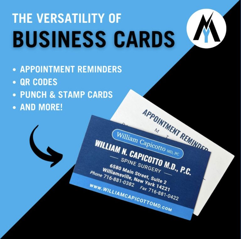
Business cards are a necessity for any industry. Your business card is a reflection of you and your company, and can be the deciding factor whether a potential client contacts you or tosses your information in the trash bin. In “Business Cards 101: Creating Memorable Business Cards” we offered several design tips to help you set your card apart from the competition. Having a strong design is key but even the smallest typo can ruin that design and damage your professional image.
Common Business Card Mistakes You May Be Guilty Of
Avoiding simple, common mistakes could be the difference between growing your business or being tossed out with last night’s leftover pizza. Be sure to review your design thoroughly and check for these print blunders:
Misprints
This should be an easy one. Proofread your business cards before printing them out and double check the cards after they’re printed. Nothing will cause your business card to become a useless piece of card stock like inaccurate or misspelled information. Wrong url? Your website traffic will drop. Incorrect phone number or email? Potential clients won’t be able to get in touch. As simple as it may seam, misprints are the most common mistake and it has the potential to make your business card ineffective.
Use the Right Paper
Business cards are like handshakes, both of which should be firm. Too often with cost cutting efforts you could be tempted to just say “paper is paper, what’s the difference?” but nobody wants to receive a limp business card. A business card should be card stock paper otherwise the message you might be trying to convey can go from “we would really like your business” to “here, throw this out for me”.
Too Much Information
Your business card should be an introduction to your business or product. Too often business cards are littered with unnecessary information. Your business card shouldn’t be a sales pitch. If that’s your intention, perhaps accompany your business card with a nice brochure or flyer.
Not Enough Information
Even worse than too much information is too little or missing info. At the bare minimum, include your Name, Title, Phone Number, Email Address, and Website. Does your business have a Facebook? Twitter? Instagram? Include your social media handles on your cards to give potential clients every avenue to explore your business and create exposure.
Use Both Sides
A business card has two sides, both of which should be utilized. While it’s always recommended to leave some space on your cards in case you want to write something down, the back of your cards should not be blank. Instead of a blank back, showcase your social media links or even your company motto.
Whether you need business cards or are looking to update your existing design, New York Marketing has you covered! Trust us to provide high-quality printing at an affordable price. With a variety of size options, stocks, and finishes, you’re guaranteed a product you’ll love! Call us today at (716) 632-7200 for your next print project estimate.


