As a brand, it can be tempting to stay with what has worked. With that in mind, it is also important to remain cognizant of the changes occurring in society and within consumers. The public’s tastes and priorities are constantly evolving. In order to stay relevant, some brands have decided to rebrand — and Jell-O is one of them.
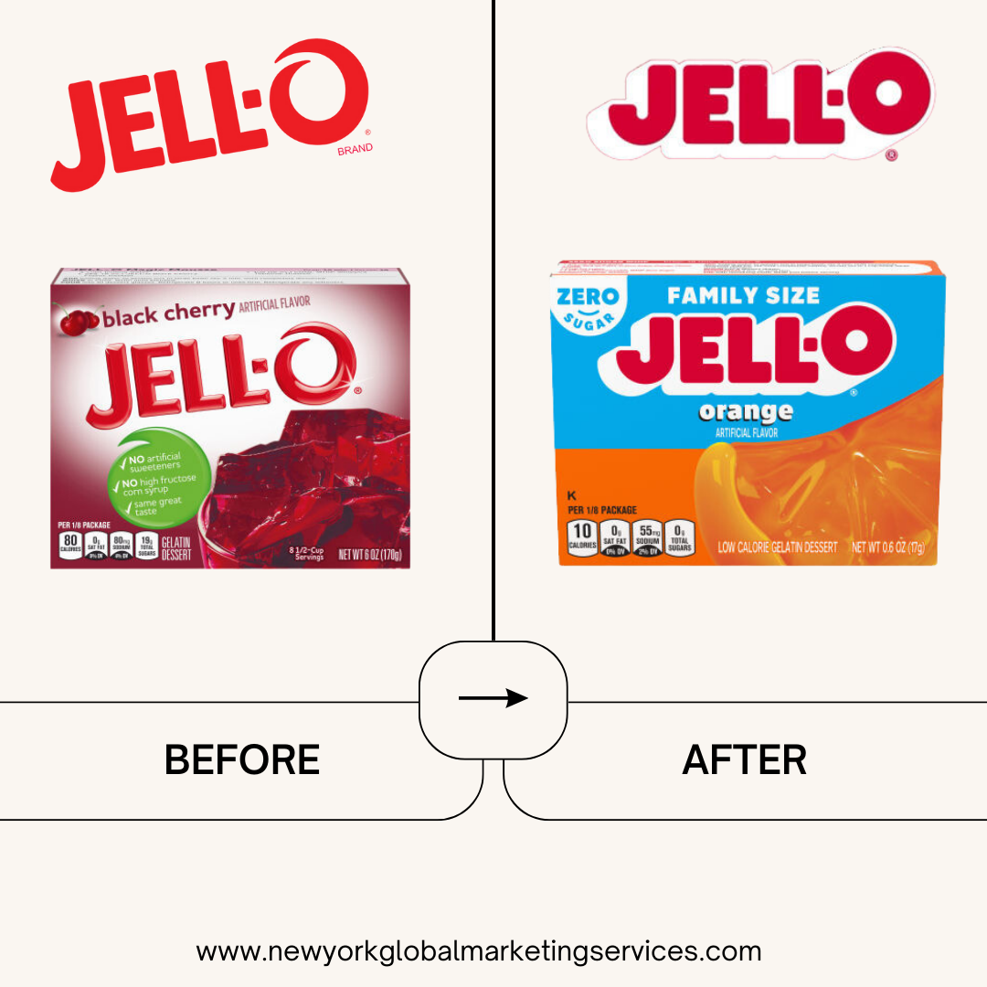
For the first time in 10 years, Jell-O has revealed a new logo and updated packaging. The rebrand was designed with an eye on the present and future, while still keeping true to its playful roots. Their new visual identity positions the brand for a new generation of parents, with a modern aesthetic that still holds onto its colorful roots.
More and more brands are beginning to recognize the importance of staying up-to-date in order to remain competitive and connect with consumers. For over 178 years Jell-O has been a staple in many households, but they were aware that they needed to do something to keep up with modern day consumers. A rebrand was the answer, and it looks like they pulled it off!
Jell-O is a great example of how brands can evolve while still sticking true to their core values. It’s a reminder that taking calculated risks can pay off in the end. If you’re considering making a change with your brand, remember that it could be the push your brand needs to stay relevant and competitive.